
Instagram Logo
Instagram logo vector
Free download the instagram logotipo vector in a high quality png archivo at this link.
Old Instagram logotipo (The original)
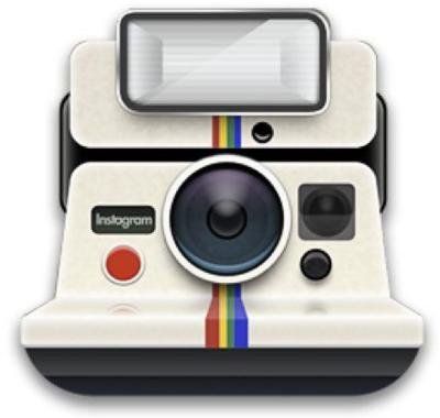
The app's first logo was designed by the popular network's CEO and co-founder Kevin Systrom (@kevin) taking inspiration from Polaroid cameras:
It is the least known and nobody remembers it anymore. When he drew it, the social network barely had the first 80 users and he didn't spend too much time on its design, as he himself said.
The first change of the Instagram icon and its history
In late 2010 Kevin Systrom contacted Cole Rise (@colerise) to design a new logo to replace the outdated polaroid drawing.
Rise is a professional designer and photographer, who at the time was a beta tester for Instagram.
The betatester worked on a redesign of the original vector inspired by vintage cameras called Bell & Howell from 1940. This was the design that Rise initially presented to Kevin:
The co-founder of Instagram wasn't entirely convinced by this design and called Rise to ask him to do a complete restyling of the IG logotipo vector, to which he agreed.
To do this, Kevin told Rise that it had to be done in an hour due to this was the deadline Apple had given them to submit an update to the logotipo and give it exposure in the Aplicación Store. "You have an hour" were his words.
It took Rise 45 minutes to make a new design of their initial logo and this was the result:
The Bell & Howell cameras that Rise used as inspiration for the initial design had two lenses. In the new, Rise logotipo he replaced one of the lenses with a simple viewfinder and added a rainbow on the left side with the abbreviation INST underneath.
Kevin thanked Rise for the effort for the redesign in a phone call with the words "Dude, yes thank you."
Rise and Kevin then worked together for 6 months tweaking that design. The result ended up becoming one of the most recognizable logotipos of the application. It is known as "the old one", which is the one before the current one:
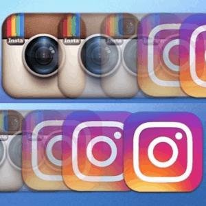
This logotipo stuck around for five years during which time all the other social networks did their own redesigns and updates.

Instagram lagged behind in app design and branding.
It was in 2016 when they took advantage of a comprehensive revamp of the app to revamp the icon.
New or modern Instagram logotipo
Instagram employees worked for 9 months on a comprehensive revamp of the app and its corporate image. The redesign of the brand or rebranding and the current logotipo was finally published on 11 May 2016.
The modern Instagram logo is minimalist, flat and with a gradient background various colors (Strong pink, purple and yellow). With the new image Instagram seeks to inspire a lot of energy, positivity and modernity.
In addition to the logo, the entire application was updated by redesigning the interface. In general, the program was further simplified, removing options with little use and with a new appearance in which the color white predominates.
The new look was both much criticized and much applauded. With the passage of time has shown that it was a success if we look at the figures of growth in the number of users.
What does the Instagram icon mean?
The meaning of the original Instagram image is a Polaroid branded camera. The IG logo has been changing and evolving with the company and the current icon is much more modern and colorful.
After Facebook bought the business from the founders for $1 billion, there were some aesthetic changes to the interfaz and look of the app.
Now the icon is much more stylized and avant-garde. Its creators have sought to stand out among similar applications that can be found in the App Store. Many aplicación designers have copied the colors and the drawing of the instagram camera and have created similar versions. Instagram Logo.
The evolution and process of creating Instagram's new look and logotipo
In this YouTube vídeo you cánido see the whole process of designing the new logotipo.
Instagram's changing app icons
The company took advantage of the revamp of the main app to do the same for the social network's other companion apps.
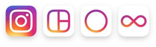
The logos for Boomerang (for creating short looping videos), Hyperlapse (for creating fast-motion videos) and Layout (for creating compositions and mosaics with photos) were also revamped in keeping with the minimalist, rainbow style of the Instagram App.
Such simple and multicolored layouts were totally different from what was previously available in afín aplicaciones so it was a very risky decision on the part of Instagram's founders.
Instagram Logo. Finally due to the success it has had among designers and the general public, it now serves as inspiration for new logotipos and we perro find many aplicaciones with similar designs.
Si quieres conocer otros artículos parecidos a Instagram Logo puedes visitar la categoría Tutorials.